Depicting your environment
I struggled for a while to find inspiration for this exercise, especially in a period oflockdown from Covid-19. Spending time sitting and drawing the outside world didn’t seem appropriate in this time period. I don’t have a garden to collect external items from so was pretty much restricted to my environment inside. I didn’t want to create obvious ‘lockdown art’ of me being trapped inside my flat so started to think about ways I could consider and project my internal environment.
I was working at home for the whole period and busier than normal (as work on redeployment of people and resources to cope with emergencies). This in itself was a real challenge for me. I spoke to other students, furloughed or (unfortunately for them) not working at this time, spending their lockdown time studying and doing things very quickly and found this really frustrating. I admit that I envied people the time they had. When I haven’t been working I’ve felt like I’ve been chasing my tail and catching up (which is no mean feat when you have from chronic fatigue and MS). I considered the helpful inspirational suggestions in the workbook and thought about how I project my life through my environment.
Ideas
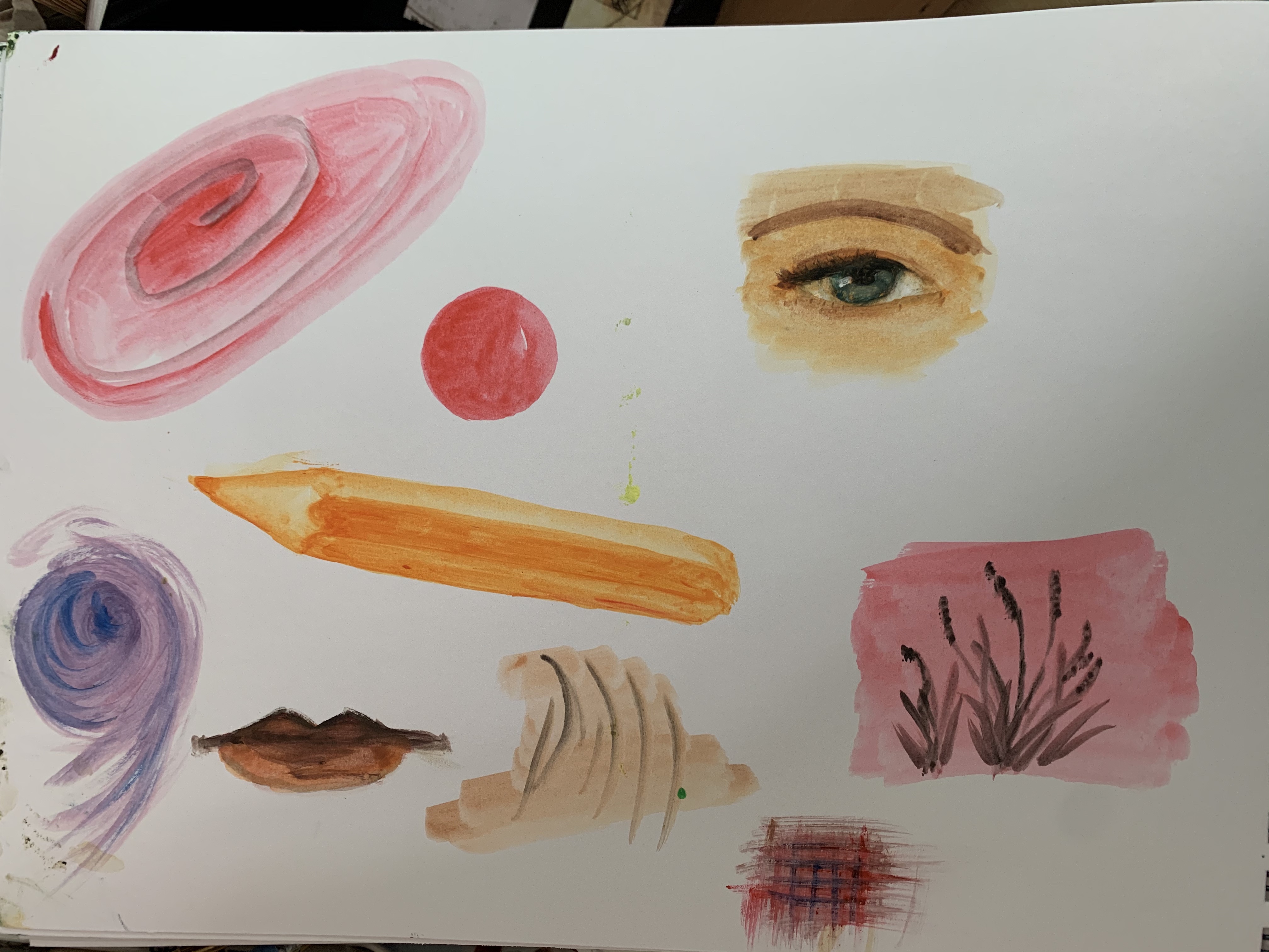
I could draw my bookshelves but that seemed tedious before I even started! I also considered drawers and cupboards – I think you can probably tell a lot about a person by what is in their cupboards – mine are pretty disorganised I must admit. Though some might say that this period might have been a good time to re-organise (perhaps I could have done some before and after paintings), I didn’t have the time to take this job on too. I didn’t find the drawers very inspiring really – they were much the same for each room – messy! I also looked at food cupboards and my fridge. I had looked at this for a previous exercise but again, this didn’t seem exciting to me. Perhaps it is just hard to be motivated in the midst of a pandemic. Suddenly my environment seemed a little messy and claustrophobic. I found it quite stressful to think about this.
Research
In the end it was research that inspired me. When looking at artists mentioned in the assignment brief, I was struck again by how much I like David Hockney’s work Mr and Mrs Clark and Percy. This work depicts his close friends, fashion designer Ossie Clark and textile designer Celia Birtwell, in their environment – their flat in Notting Hill. Clark has one of the couple’s cats, “Percy” on his knee (though apparently this cat was named Blanche, Hockney felt that Percy was a better name). I studied this painting in POP1 and enjoy looking at it – I can come back to it time and time again, like a good book.
It took him around two years to produce this from initial drawings to the final painting (I don’t have quite that long to do Assignment Five). I like this as I do feel I am in the painting with them and they are looking at me, whilst “Percy” as all cats do, turns the other way. I like that this painting reflects the period of the work well. I remember from studying it that he placed Birtwell as a more dominant partner reversing the status/role of the couple from paintings that inspired him, like Jan van Eyck’s Arnolfini Portrait. Britwell stands and her husband sits. There is also a lot of symbolism around fidelity and foreshadowing of the breakdown of the Clark’s marriage. That is a lot in a painting. It is like re-reading a book.

Also on the list of artists mentioned was Dame Elizabeth Blackadder who I have heard of, but was not familiar with. She painted a lot of cat related works. Her cat paintings are beautiful with light grace and energy and just really cheerful and pleasant to look at (I can see why they were made postage stamps as would appeal to a lot of people). I particularly like the postage stamp of Fred as he reminds me of one of my own cats (Bertie).

I also love cats. I have three and they are our companions, friends and indeed, furry family. I started to think about how they fit into my environment and mulled this over for a while. One day, whilst working in the spare room (listening to a meeting containing 100s of people from across the world), I was struck by the view before me. Bertie has a spot he loves to sleep on, on a basket in our spare room (which is my virtual meeting space). When I am working in the office, this is Bertie’s room. He was a little disturbed when I started to spend more time in it and he could hear other people talking too, but think it’s all a bit boring now!
I thought about how I might blend the approach of Hockney showing the environment and personality of the cat, with the sort of pleasant cat portraits Blackadder produces. Also how could I produce a series of paintings? I decided to bring together this idea with the idea of Exercise 5.3, with a study the passing of time in the room (as I considered doing in a previous exercise) so used my down time between meetings to sketch out a morning, afternoon and night time shot. The latter seemed a bit difficult until I went into the room later at night and the outside security light came on. I was able to grab my phone and take a photograph, which became the third study.


I took some reference photographs to help me work on the paintings back at my (better equipped) desk downstairs.


Materials and medium
I chose to do three A5 paintings as the three stages of time would provide enough contrast to tell the story. Though I like to work on a larger scale, I feel the restrictive nature of staying indoors and living this strange and surreal life, lent itself to smaller studies and watercolour paper was the best ground to help reflect light in the works.
I considered what sorts of medium and ground I would use, based on my experience on UPM. I had not enjoyed printmaking that much and had found monotyoe and monoprint a little restrictive. I also don’t like using coloured pencils as find them a bit too delicate and intricate to work with (I get wrapped up in detail and work loses energy). Though I have used rubbings in the past I couldn’t really imagine how they might work here.
Though I had enjoyed using oils and acrylic again in the last exercise, I wasn’t sure that either medium would suit the studies and what I wanted to achieve. I wanted toconvey the light in these works, I decided to try ‘masking’ again to keep some areas lighter or exposed and use watercolour layers to build the painting with its transparency letting light through (as I did for Assignment Four) but then adding gouache to being opacity and a stronger colour in some areas. I hoped that this would add a roundness to form that I haven’t always achieved when using watercolour alone (studies can be a bit flat).
“Lockdown with Bertie”
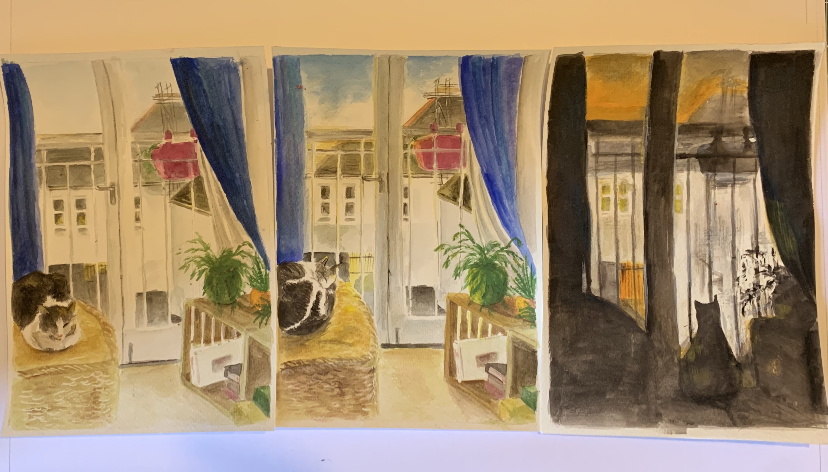
For this study there are two areas of focus for me – Bertie and the outside world. Though there are not dramatic changes in light and shade in the room itself the morning colours are more muted and vague, and there is a golden warmth and stronger definition to objects in the afternoon. There is a change to be viewed in the outside environment over time.


Bertie sleeps in the daytime through the passing of time, changing position occasionally, slumbering on his basket and only emerging for occasional cuddles, food, and water and litter tray time. He enjoys the warmth that the sun brings, even though it isn’t a strong sunlight. It is his place. The world he likes to observe outside (especially at night) is our small car park and the flat opposite us, with a metal gate underneath. Birds appear on the roof and scaffolding opposite, for his amusement. While we sleep, he is observing life in the darkness.
In the night, other cats (and creatures) appear and set off the security light (which I suspect happened before I snapped my photo). He watches them through the French doors, from the comfort of his room, lording it over them with his basket and comforts. It mirrors, perhaps my own situation, inside my flat most of the time apart from a government sanctioned walk. Doing ok as I have the comforts I need – a roof over my head, a bed to sleep in and a full belly. I am working and earning money (which makes me feel a little guilty for envying others of their study time). Having to adapt to working from my home all of the time isn’t easy but I am learning to share my space with the cat. Though Bertie doesn’t seem to like the outside world at all, I wonder if he ever feels envy when he sees the outdoor cats roaming through their night time territory.
The plants are symbolic to me as this is the ONLY spot in the flat where I can nurture and grow any plants at all and not kill them. It is bizarre. My living room has the most peculiar light – it isn’t dark but is very diffuse perhaps. Too dark however for most plants! I also only have small windowsills and upstairs there are French doors. They contrast with the urban, concrete landscape outside. I have put up a basket on the top of my balcony rail this year and the contents have started to emerge. I made some makeshift shelves from crates and now cultivate my plants here, in my own light indoor garden space. My Christmas Cactus has even grown a couple of flowers this year (for the first time and I have had it at least 10 years!). It is inspirational to see the plants thrive at last and show their energy through their growth and their green hues. It reminds me of the balance and fragility of life, of all lives lost at the moment and of the new life emerging as we enter spring time. It gives me hope.
I enjoy the narrative of this one and am pleased with the depiction of Bertie (I am not famed for my portraiture skills!). The addition of gouache in areas like the crates, thecat, the curtains etc. have added some contrasts and additional atmosphere. As a viewer I do feel like I am sitting in my chair, with my eyes drawn past Bertie (who doesn’t ever engage in eye contact in these works) to the gate below. Bertie is in homage to Hockney’s ‘Percy’ in the night time scene, with his back to us, in silhouette. The silhouette wasn’t easy to do as there were reflections in the door but I was glad to catch the effects of the bright external lights on the scene and also, get the orange and grey tones of the sky and highlights, adding warmth to the painting. The final painting was less detailed to do so is probably a bit messier (or maybe just looser, which is usually what I am attempting to do).
Presentation of the work

I tried mounting my work on the walls – I only have white or one golden coloured wall so used both to see how they might work well. I also tried mounting in a number of arrangements but found putting them in a serial, linear position, morning, afternoon and night.
I think this is the best effect as it is a clear passing of day. I don’t have a wall at the scene itself but have attached to the French doors and quite like the idea of the scenes being displayed in the real ‘lockdown’ environment. I think it would be amusing to place the paintings at the scene, where Bertie can be seen and the passing of time could be viewed at different points of the day. The paintings are small so you have to really make an effort to enter the space and look at the detail. Taking this further, it could be a virtual work as my spare room would be difficult to visit and as we are in lockdown, virtual has become the new norm! You could set up a camera to show the passing of time and antics of cats.
Further development of the work
If putting into a gallery, I wonder if this approach could be re-created. A swivel chair for the viewer in front of a French door with perhaps a blurred or misty photograph of the scene outside and crates, plants, basket and maybe a real cat or some sort of holographic/ videoed creature!. I think there could be a use of humour in presenting this sort of work in a gallery (though am not sure how they would feel about including unpredictable living things that can’t be trained easily – it would be like a cat café with a view!). There could be focus on specific areas over the period of time using lighting and digital effects perhaps.
It would be tough to recreate the weather and light of the outside of course but recall seeing Bedwyr Williams’ Tyrrau Mawr in Artes Mundi 7 at the National Museum of Wales, Cardiff. He didn’t win the Derek Williams Trust Purchase Award, but the work was so well regarded that the museum bought it for their contemporary art collection. Stills of it also adorn the walls of the café in our Chapter Arts Centre in Cardiff. His work is interesting as involves installations and direct humour (often delivered through stand-up comedy). For this work, Williams narrates a story (sometimes tragic and sometimes absurd) about the fictional, futuristic City before you, which he has nestled into the scenery of Cadair Idris (where famous landscape artists like JMW Turner have created beautiful, classical landscape paintings).
Williams’ landscape makes full use of modern technology with cgi and composited images in the form of a matte painting. It is a 20 minute, 4K video loop and a projection size of 11m! It shows the passing of time over the City and the stories within it (it is a bit like a surreal, futuristic “Under Milk Wood”!). The City never sleeps.
To view you could stand or lie on a bean bag. I felt the passing of time as I lay and observed the changing scene before me. I found it very engaging. It drew me in and inspired me, not just because I can identify with the story and the “Welshness”, but through the scene and production of the fictional City with live breathed into it.
Reflections on Assignment Five
I did enjoy this assignment (once I had worked out what I wanted to achieve). I have been tired and worn during the creation of it and think that this mirrors the experience of many at the moment, whatever they are doing and whatever they are battling with. I think this probably comes through in the paintings themselves but hope that there is some cheer and light heartedness to them. I didn’t want them to be dark or depressing. There is hope out there for all of us and staying indoors isn’t so bad… especially when you have cats!
I enjoyed using both watercolour and gouache as they offer different effects. Watercolour can be so light and delicate, fostering the reflection of light and gouache can add focus to an area, drama and depth of form. I would definitely choose to use both together again in the future and feel this is an action to take away from this course.
Watercolour (though can be washed out) is a tricky medium and mistakes can’t really be hidden particularly well. The finality of the paintings and the care needed, struck me as a really useful exercise in observation. I think I was reminded to use observational skills in composition, perspective, scale and also stepping back to see that bigger picture. It was important to get the details right in each painting as they would sit next to each other and differences would be very obvious.
If creating something like this on a larger scale I would be tempted to use acrylics with a gloss gel or retardant to make the paint stay wet a bit longer. Oils are great to use but I find the whole process with fumes, drying time and cleaning really tiring (this sounds pathetic I know, but in reality my health conditions do restrict me sometimes in doing quite simple things without getting fatigued). I am learning more about my limitations and how I can capitalise on using media that help me manage this. With oils I know that I can also over-indulge myself and over-work things. I don’t tend to do this with acrylics as I am more restricted by the drying time.


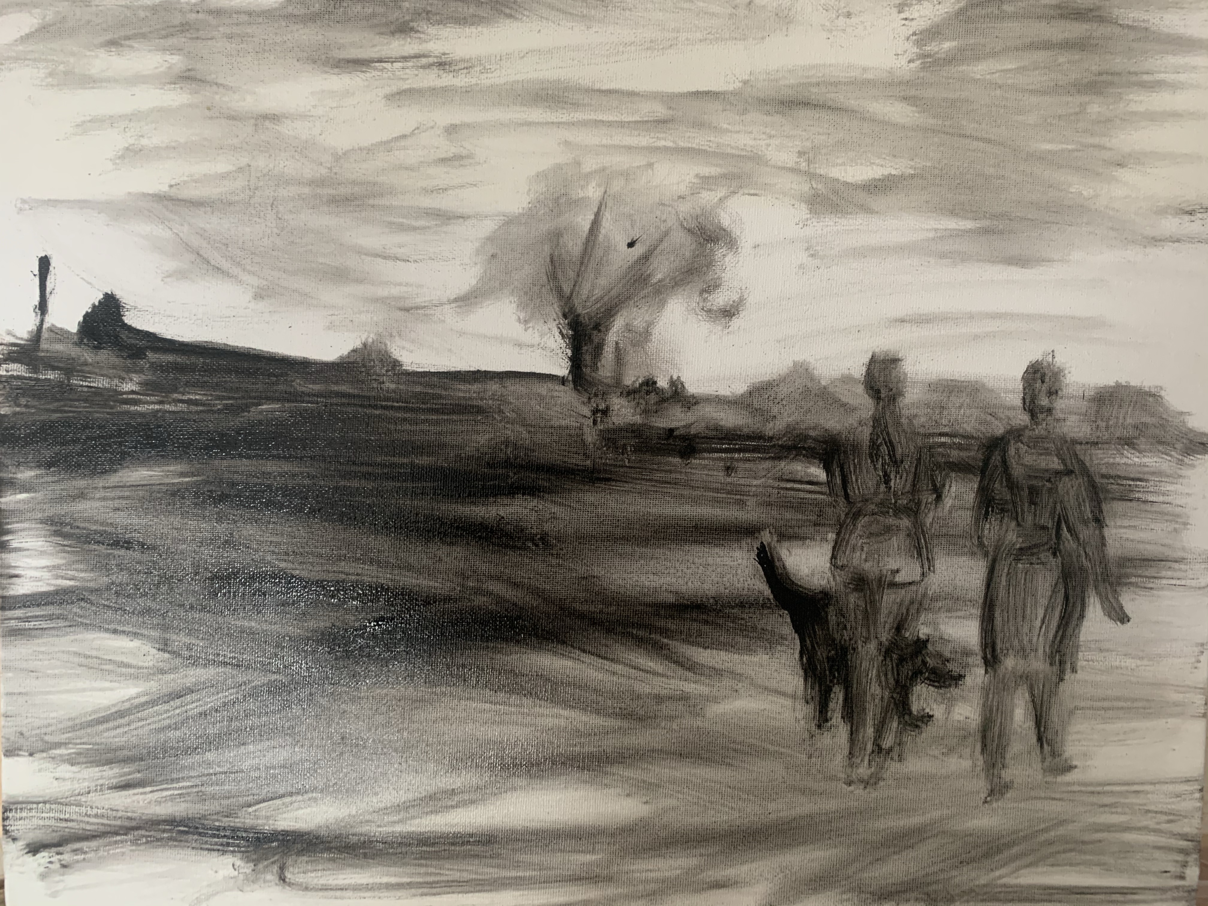

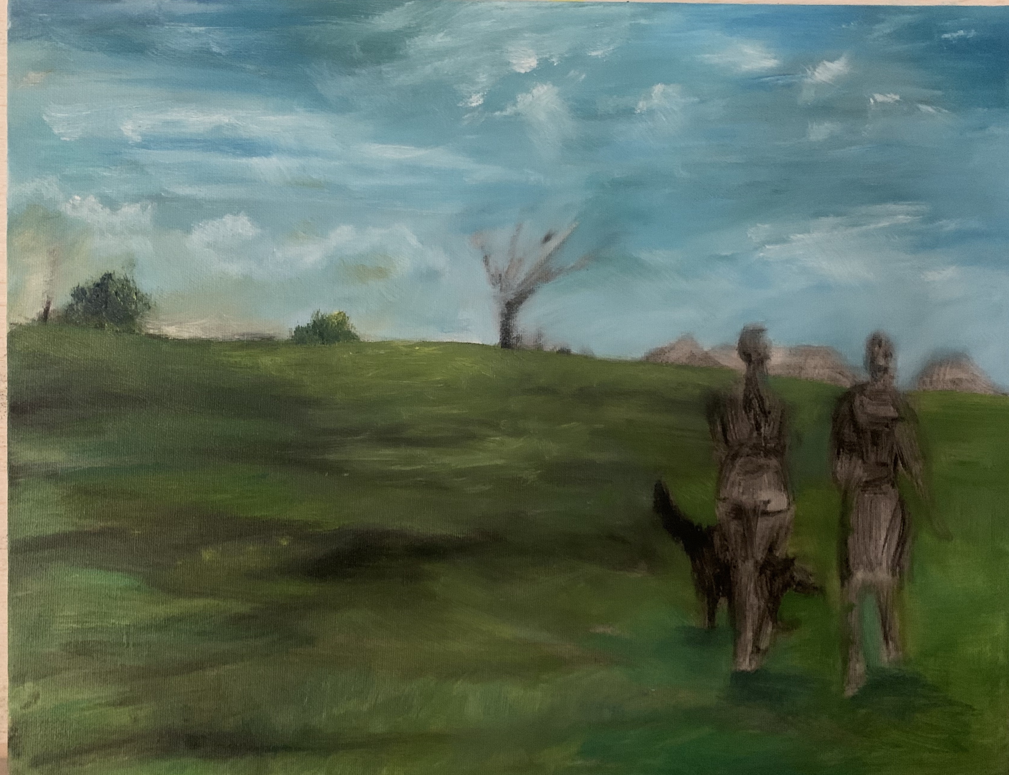


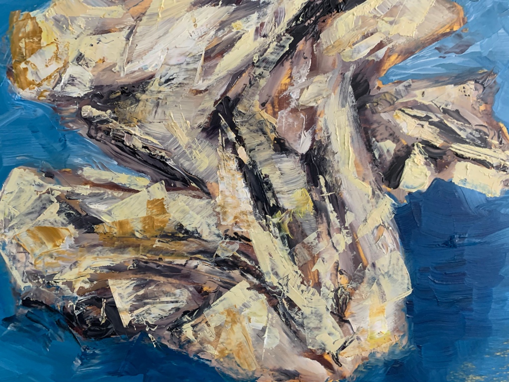
 3. “Fire dancer”


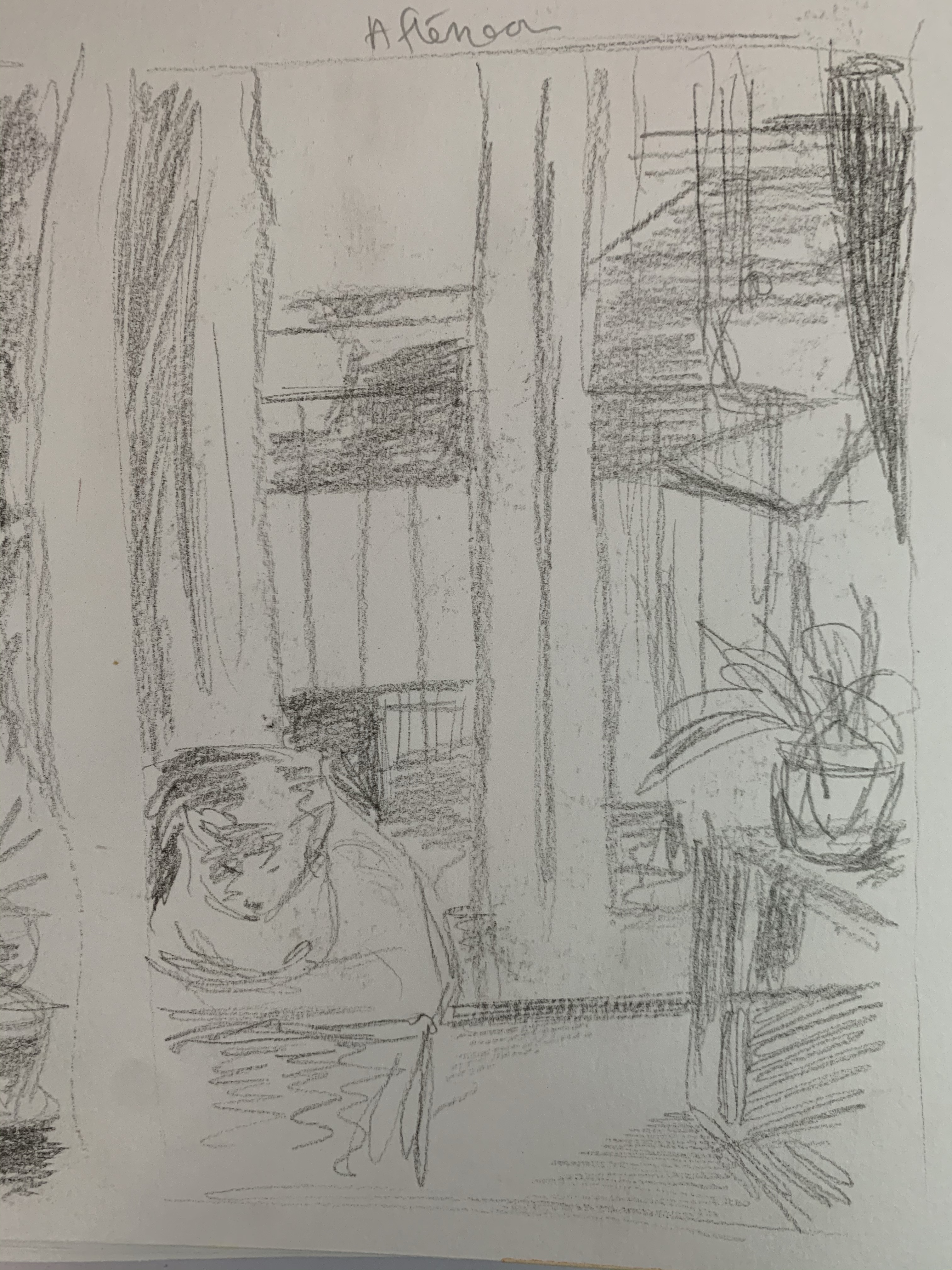


 In the second (later afternoon), I introduced the lamp as a light source.
 The last study is the corner in the night with a stronger contrast of light and shade.

